 wait I might have figured this out.
13 posts
• Page 1 of 1
Dishonored Fanart thread!
![]() » Wed Aug 01, 2012 12:46 am
» Wed Aug 01, 2012 12:46 am
wait I might have figured this out.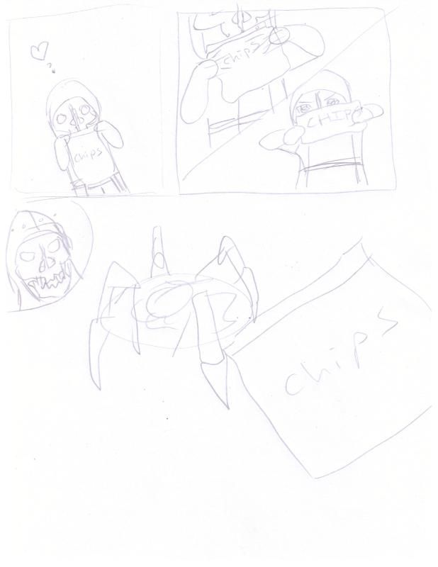
-
I’m my own - Posts: 3344
- Joined: Tue Oct 10, 2006 2:55 am
![]() » Wed Aug 01, 2012 3:17 pm
» Wed Aug 01, 2012 3:17 pm
-
Jessie - Posts: 3343
- Joined: Sat Oct 14, 2006 2:54 am
![]() » Wed Aug 01, 2012 5:58 am
» Wed Aug 01, 2012 5:58 am
I sent you a pm...and thanks. I wish I knew how to do it but...lol this is so different from other forums I have been to.
-
Cassie Boyle - Posts: 3468
- Joined: Sun Nov 05, 2006 9:33 am
![]() » Wed Aug 01, 2012 2:30 am
» Wed Aug 01, 2012 2:30 am
http://img.photobucket.com/albums/v492/Momodport/rabid%20nonsense%20random%20pics/CCI00110.jpg
-
DAVId MArtInez - Posts: 3410
- Joined: Fri Aug 10, 2007 1:16 am
![]() » Wed Aug 01, 2012 2:35 am
» Wed Aug 01, 2012 2:35 am
It's quite amusing indeed. I hope for someone to make a sort of comic like the art style of Nerf Now! And adding a comedy approach to them of course.
-

Mark Hepworth - Posts: 3490
- Joined: Wed Jul 11, 2007 1:51 pm
![]() » Wed Aug 01, 2012 1:32 pm
» Wed Aug 01, 2012 1:32 pm
Image embedding is disabled on these forums. You have to link to the image on a hosting site. For future reference.
OT: Bit confusing. Is that supposed to be one of those razor-mine thingies.
OT: Bit confusing. Is that supposed to be one of those razor-mine thingies.
-
Alan Whiston - Posts: 3358
- Joined: Sun May 06, 2007 4:07 pm
![]() » Wed Aug 01, 2012 3:41 am
» Wed Aug 01, 2012 3:41 am
The Spring Razor mine, yes.
-
Juliet - Posts: 3440
- Joined: Fri Jun 23, 2006 12:49 pm
![]() » Wed Aug 01, 2012 11:09 am
» Wed Aug 01, 2012 11:09 am
Dishonored fan art Box Cover: http://vgboxart.com/boxes/360/46564-dishonored-full.jpg
I do have a few criticisms however. It still looks good don't get me wrong but the way I picture the perfect box art for a Dishonored Collector's Edition would be as follows:
A more gray and metallic color/style. Instead of those cogs and clocks the chaotic razor blades we see in some of the Dishonored art.
Show a few more screenshots. for example when they are talking about the powers show the mark of The Outsider on Corvo's hand and next to it the text. When talking about the Chaos system show a bit of the world off. I know there isn't a lot of room on these boxes but the signature things of Dishonored should be shown. The mask as a cover, the Tallboys, the mark of you know who and so on.
The Quotes are good but misplaced I feel. The front one especially, like I said I am not sure it fits quite well within the whole theme of the game. If it was a revenge quote probably. Maybe the the back one should be about revenge, I don't know but there are definitely better choices for them.
Also I don't know how I feel about the streaks of light. I feel conflicted about whether or not they should be there. I believe there should be something symbolic though. Light of hope? No, probably not. I am going to ask a friend who is a professional artist and see what he thinks.
Again, it looks great and I like it but it's not very Dishonored-like. Other than that it's really good. The best thing about it is probably the front. Not only will that get people's attention but that is cut from the first screenshot that was revealed to the public and the art style used in that screenshot is really good. I think they should draw everything on the box in that style with a little tweak on the shading. (Here is the screenshot I mentioned: http://www.wired.com/images_blogs/gamelife/2011/07/dishonored-spreadcover.jpg)
-

marina - Posts: 3401
- Joined: Tue Mar 13, 2007 10:02 pm
![]() » Wed Aug 01, 2012 12:40 am
» Wed Aug 01, 2012 12:40 am
Dishonored fan art Box Cover: http://vgboxart.com/boxes/360/46564-dishonored-full.jpg
I do have a few criticisms however. It still looks good don't get me wrong but the way I picture the perfect box art for a Dishonored Collector's Edition would be as follows:
A more gray and metallic color/style. Instead of those cogs and clocks the chaotic razor blades we see in some of the Dishonored art.
Show a few more screenshots. for example when they are talking about the powers show the mark of The Outsider on Corvo's hand and next to it the text. When talking about the Chaos system show a bit of the world off. I know there isn't a lot of room on these boxes but the signature things of Dishonored should be shown. The mask as a cover, the Tallboys, the mark of you know who and so on.
The Quotes are good but misplaced I feel. The front one especially, like I said I am not sure it fits quite well within the whole theme of the game. If it was a revenge quote probably. Maybe the the back one should be about revenge, I don't know but there are definitely better choices for them.
Also I don't know how I feel about the streaks of light. I feel conflicted about whether or not they should be there. I believe there should be something symbolic though. Light of hope? No, probably not. I am going to ask a friend who is a professional artist and see what he thinks.
Again, it looks great and I like it but it's not very Dishonored-like. Other than that it's really good. The best thing about it is probably the front. Not only will that get people's attention but that is cut from the first screenshot that was revealed to the public and the art style used in that screenshot is really good. I think they should draw everything on the box in that style with a little tweak on the shading. (Here is the screenshot I mentioned: http://www.wired.com/images_blogs/gamelife/2011/07/dishonored-spreadcover.jpg)
I do have a few criticisms however. It still looks good don't get me wrong but the way I picture the perfect box art for a Dishonored Collector's Edition would be as follows:
A more gray and metallic color/style. Instead of those cogs and clocks the chaotic razor blades we see in some of the Dishonored art.
Show a few more screenshots. for example when they are talking about the powers show the mark of The Outsider on Corvo's hand and next to it the text. When talking about the Chaos system show a bit of the world off. I know there isn't a lot of room on these boxes but the signature things of Dishonored should be shown. The mask as a cover, the Tallboys, the mark of you know who and so on.
The Quotes are good but misplaced I feel. The front one especially, like I said I am not sure it fits quite well within the whole theme of the game. If it was a revenge quote probably. Maybe the the back one should be about revenge, I don't know but there are definitely better choices for them.
Also I don't know how I feel about the streaks of light. I feel conflicted about whether or not they should be there. I believe there should be something symbolic though. Light of hope? No, probably not. I am going to ask a friend who is a professional artist and see what he thinks.
Again, it looks great and I like it but it's not very Dishonored-like. Other than that it's really good. The best thing about it is probably the front. Not only will that get people's attention but that is cut from the first screenshot that was revealed to the public and the art style used in that screenshot is really good. I think they should draw everything on the box in that style with a little tweak on the shading. (Here is the screenshot I mentioned: http://www.wired.com/images_blogs/gamelife/2011/07/dishonored-spreadcover.jpg)
-
u gone see - Posts: 3388
- Joined: Tue Oct 02, 2007 2:53 pm
![]() » Wed Aug 01, 2012 7:48 am
» Wed Aug 01, 2012 7:48 am
It is quite good and I am still stuck on that site because I love box art.
-

Kortknee Bell - Posts: 3345
- Joined: Tue Jan 30, 2007 5:05 pm
![]() » Wed Aug 01, 2012 8:52 am
» Wed Aug 01, 2012 8:52 am
About the font - I instantly recognized it as Carleton. If it looks familiar, it's likely because it's one of the main fonts used in Thief 
-
bimsy - Posts: 3541
- Joined: Wed Oct 11, 2006 3:04 pm
![]() » Wed Aug 01, 2012 1:47 pm
» Wed Aug 01, 2012 1:47 pm
Ah, Thief. The king of stealth. The perfection in level design. A great game that inspired the creation of Dishonored (well in a way it kinda did...I am trying to be dramatic here so don't ruin it!). Too bad I can't play my favorite game of all time (Thief 2) because of some weird bug that just popped out of nowhere. I guess I am cursed not to pre-order Dishonored (at least with the Tarot deck but damn it I want that thing badly) and to not play my favorite game. Tis' a sad day it is...a sad day indeed. (And yes I did try everything. The magical patch that fixes everything for everybody. Contacting support and following every instructions of them and fellow Thief fans. The only thing I haven't tried is reinstalling but I can't do that at the moment unfortunately. That will probably fix it and it is just making fun of me at this point.)
-
Soph - Posts: 3499
- Joined: Fri Oct 13, 2006 8:24 am
![]() » Wed Aug 01, 2012 2:39 am
» Wed Aug 01, 2012 2:39 am
Strife, I wasn't quite clear on whether you wanted the box to reflect the old GI cover or something else. I tossed the quotes around in my head and they seem cool at first blush; they have a certain rhythm. They don't fit well at all though with your circumstances and judging by there being "no good ending", honesty won't change much of anything. I think the Outsider brand should have been used in large for the back of the box with different shadings for the font and whatever screenshots would be applicable to that text would be overlaid. The brand would still be in prominent view though, always communicating that you've been shifted to the shadows for good. The pressures from political powers and the Abbey combined seem to all but ensure that outcome as well as the deal itself, Faustian trappings mayhaps. A rat could be at the end of one corner, wrap around the spine and onto the back of the box where I imagine his face would be, eating at the backdrop and the eaten spot could be white or a starkly contrasting color---reinforce our furry friend/nemesis and their numbers in the game.
Your ideas have more unity though. I sound like I should be committed lol.
Your ideas have more unity though. I sound like I should be committed lol.
-

GRAEME - Posts: 3363
- Joined: Sat May 19, 2007 2:48 am
13 posts
• Page 1 of 1