Updated impression:
Wanted to update my impression after I have had a closer look at the gameplay trailer.
Saw another corpse explosion (killed by railgun) that does not look similar to Unreal Tournament like the first one I saw (killed by rocket launcher), so some unexpected variation there.
The thing I still find similar to Unreal Tournament is some of the enviroments (much so) and the characters appereance a bit (the woman in green armor and that character with the "dash" ability which both look like they ripped from Unreal Tournament character design maybe not even on purpose). Suspect that the whole similarity thing has something to do with the hue of the graphic, especially in those Amazon Temple type levels but also when The Ranger (Quake I) fires that teleport ability in the gameplay trailer the first thing to come to mind was the Shock Rifle plasma ball from Unreal Tournament. The game still looks too similar to Unreal Tournament at some points and/or enviroments in the gameplay trailer. It would maybe be an idea to add some enviromental effects to make the game stand out more?
As for that eye-level thing I still find it looks like a cheap attempt to be original, but there is alot of effects and things they could do to that thing to make it anything to stand apart from unoriginal design. Looks like a bad rip from 90's chewing gum sticker...
It is a game in early development so many things will change.
Visor(?) looks awesome in the gameplay trailer.
The game looks very beautiful otherwise (not made my mind about Anarkis Flak Cannons arms and legs yet though) and hopefully will not just be a Quake+Overwatch with Unreal Tournament graphics mashup.
Sorry for being so skeptic but the gaming industry somehow seems to be heading towards that same Hollywood route of an endless copy of ideas stream where things are just dull and the story always predictable.
All the best luck to the development team. ![]()
Old post:
Hi.
New to this forum, so not sure if this has been brougth to attention before. I really liked Quake III: Arena and am currently playing Quake Live (<3).
The first impression I got from seeing Quake Champions was a deep suspicion of how the gaming industry is recruiting and handling talent.
This games first time presentation looks like it is stealing ideas from Owerwatch while using Unreal Tournament 3 graphics. Actually like a cheap mod with super technological graphics with no substance other than stolen aesthetics from Unreal Tournament 3.. Even the character exploding corpses deaths look like they are straight ripped from Unreal Tournmanet 3 (probally just early placeholders, but who knows if they will even remember to change this in the final development of Quake Champions). ![]()
Do they just hire/use new talent technical competent workers without giving any guidance at all when developing a loved franchise?
That is the impression I got when I saw the first time presentation and gameplay videos and looking at the screenshots just makes the impression even much more sore.
E.g. the new Anarki design. (I found out that I am not permitted to post links in my posts after writing all this, so I will refer to the screenshots by text only...)
Looks like they butchered the Anarki character and then replaced his left arm and both legs with the Flak Cannon from Unreal Tournament. :-s
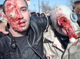
The picture where Visor(?) attacks the Quake 1 guy kind of gives me the impression what a new arena Quake game is supposed to look like:
Except that the style still looks very-way-too-much like an Unreal Tournament mod (with higher resolution and every stuff expected for a game at present time, so maybe more like that current free-to-play Unreal Tournament rather than Unreal Tournament 3).
This is an extremely unoriginal/unprofessional take on graphical aerstethics and game presentation. It all looks very fine done technically but that does not excuse it from looking exactly like it copied one of its competitors! ![]()
All the color flares, tints and gradient from Quake Live (which where further developments upon the graphical presentation of Quake III: Arena) are gone!
Too bad again I cannot post direct links to screenshots, but the one screenshot with three characters (a woman with gray hair and green armor, a red robot jumping and that guy with the "dash" ability, all new character I think) really hits my point.
That would be exactly Unreal Tournament aestethics with some minor variation in character design.
Is this really what Quake should look like or is it the work of some unexperienced/unguided artist inspired by competitors like Overwatch and Unreal Tournament with a graphical presentation looking nothing more than an average mod? ,:-S
Guessing this game is meant for a new generation hyped by Overwatch that never has never seen Unreal Tournament 3 (or the free-to-play one) before maybe?
Just to clarify I am/was otherwised very impressed that they are developing a pure arena shooter that is a Quake game, but what is the purpose if the game is going to look like Unreal Tournament 3 and play like a Quake Live mixture with Overwatch while not even have its own unique graphical presentation preserved? :-S
I am almost mystified by this whole thing. How can someone make such a bad design decision for a franchise so fameous and loved or is it maybe going to be tweaked to appear intellectually aesthetic before release?
It is like if Donald Duck cartoons suddenly tried to copy (e.g.) DC comic draw style, copy some other type of storytelling (the special ability thing) without changing anything else about the comic(?) and say they made it for the fans.
The ability thing does not bother me much though since I still have access to Quake Live to play a more pure arena shooter, but that whole Unreal Tournament look-alike thing is truly spooky.
That eye thing in one of the levels looks just like a desperate failed attempt to appear original with the game graphical presentation, like a really bad effort to comfort fans that this will be anything new.
Of course this could all just be early work that is meant to be further worked/tweaked on until the game finally releases to give the game its own deserved identity but I put my bet on that they are too extremely feebleminded (money and fast production focused) to do so and the current game artists will get plenty of time and money to copy-paste already overly used aesthetics.![]()
Have a nice day.
Quake Champions current impression (aesthetics laughable)
![]() » Tue Sep 06, 2016 3:38 pm
» Tue Sep 06, 2016 3:38 pm
-

saharen beauty - Posts: 3456
- Joined: Wed Nov 22, 2006 12:54 am
![]() » Tue Sep 06, 2016 9:33 pm
» Tue Sep 06, 2016 9:33 pm
As rendering techniques and assets converge on photorealism the visuals of games likewise converge.
You are asking to preserve the aesthetic of a 17 year old game. The assets are literally several orders of magnitude denser and thus come with a plethora of new technical and artistic considerations. Your comparison to UT is likely born from the aesthetic of these games never being that different to begin with and UT3 being on this side of the massive leap in graphical fidelity enabled by techniques such as normalmapping and per-pixel lighting. Thus the visuals of UT3 are closer to Quake Champions than Quake3 despite being roughly equally separated from both by time.
-

Emily Rose - Posts: 3482
- Joined: Sat Feb 17, 2007 5:56 pm
![]() » Tue Sep 06, 2016 5:52 pm
» Tue Sep 06, 2016 5:52 pm
Aesthetics is universal and has no age if I remember correctly.
Like you mentioned the new technology allows for more technical and artistic considerations, but what are those considerations if the game looks so extremely similar to its competitor? Another display of greed or bad execution for the gaming community from a famous franchise?
The comparison I made was not between the technical similarity but rather the color flares, tints and gradients (or visual style if you like).
A game visual presentation does not have to be this similar for two different games from two different companies even if they both use the same game engine. You can (for example) compare Batman: Arkham City with Bioshock: Infinite both games made using the Unreal Engine 3.
Not sure what games you meant I compared but Quake III and Unreal Tournament III never seemed similar in their style at all to me. That would be like comparing The Fantastic Four with A Ghost In The Shell or something similar.
That being said any similarity (Quake 1 and Unreal 1? :-s ) between competing games should be developed to further have their own identity unless the gaming companies really belive that people like the games they pay for to be similar. Like braindead zombies craving for more brains...
Again my point was not on the technical aspect but on the choice for (colors/flare/bloom etc.) the overall visual experience for this game.
That is to say that Quake Champions could still have the same visual flare/identity/style as Quake Live just improved with modern technology (maybe tweeked a bit with maybe a touch of that Unreal Tournament look-a-like darkness to it just to not make it look less cartoonish than Quake Live because that might seem undesired to the masses, but stealing the exploding corpses effect from Unreal Tournament 3? ...).
It is only a matter of style and presentation that allows it to be different from its competitors rather than taking a breakneck safe design that will deliver a far less superior game entertainment value and identity for the Quake franchise one that actually might feed to its own demise.
There is no excuse at all for this game to look like an Unreal Tournament mod at all except poor design choices and artistic skills.
Again I am happy that this franchise still thrives but am concerned that this game will further seed the mindless culture of infinte copy-paste of ideas. ![]()
-
Kat Ives - Posts: 3408
- Joined: Tue Aug 28, 2007 2:11 pm